A well-known UX designer once said, “Good design is invisible.” If your readers are noticing your blog layout, it might not be doing its job. A well-structured blog layout enhances user experience (UX), making navigation seamless so users can focus on your content—not the design.
Table of Contents
Think about the websites, apps, and platforms we use daily—how often are we consciously aware of the design? The most successful UX is the one that fades into the background and allows users to achieve their goals effortlessly, whether it’s reading a blog post, shopping online, or interacting with social media.
For eCommerce business owners, an intuitive and aesthetically pleasing blog layout is more than just a bonus—it’s essential. It drives traffic, builds trust, and promotes products and services, ultimately leading to business growth. But a poor blog layout? That’s a surefire way to lose potential customers before they even engage with your content.
In 2025, it’s not just about having good content; how you present it is equally important. This post covers 10 blog layout best practices to help you design an effective UX that attracts visitors, keeps them engaged, and boosts your bottom line.
1. Implement a Centralized “Learning Center” Structure
When crafting in-depth content on a particular subject, organization is key. A structured blog layout with a centralized “learning center” helps keep related topics easily accessible.
For example, if you’ve written a comprehensive guide on fundraising for non-profits, don’t let your content get lost among unrelated posts. Instead, group all relevant content into one structured hub.
This approach enhances engagement, improves SEO, and keeps visitors on your site longer—boosting session pages and dwell time.
2. Leverage Sticky Elements for Engagement
Sticky elements are a great way to improve user experience within your blog layout. Whether it’s a navigation bar, a call-to-action (CTA), or social sharing buttons, sticky elements stay visible as users scroll, encouraging interaction without requiring them to navigate back to the top.
However, balance is key. Too many sticky elements can clutter the screen and reduce the overall UX.
3. Cut to the Chase with Quick Summaries
Not all readers have time to go through an entire blog post. A good blog layout includes a quick summary section at the beginning of articles, allowing users to get the key points fast.
This not only improves user experience but also increases the chances of your content appearing in Google’s featured snippets, driving more organic traffic to your blog.
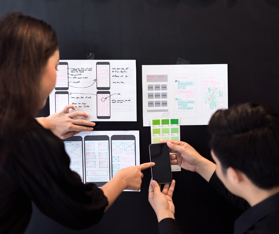
4. Adopt a Blog Card Layout for Clarity
A blog card layout is a modern and organized way to display multiple posts without overwhelming visitors. Instead of listing blog articles in one long feed, a blog layout with a card-based design offers several benefits:
- Easy to scan and navigate.
- Customizable and mobile-friendly for responsive design.
- Visually appealing with proper whitespace.
By implementing a blog card layout, readers can quickly browse and find relevant content.
5. Include Estimated Read Time for Transparency
Let your readers know how long it will take to read an article. A good blog layout includes an estimated read time near the title or introduction.
This small feature enhances user experience by allowing readers to decide if they have enough time to engage with your content.
6. Use Whitespace to Create a Balance
Whitespace, or negative space, is a crucial element in a clean and professional blog layout. Too little whitespace makes a blog feel cramped, while too much can make it look incomplete.
A balanced blog layout ensures readability and directs user attention to important sections. It also enhances content flow, making your blog easier to navigate.
7. Keep Sidebars Clean and Focused
A cluttered sidebar can ruin even the best blog layout. While sidebars are great for displaying additional information, overloading them with too many elements—like ads, social media widgets, and pop-ups—can distract users from your content.
Keep sidebars focused by only including essential elements such as:
- Social media links.
- Email sign-up forms.
- Featured posts or categories.
8. Optimize Typography for Readability
A well-thought-out blog layout includes typography that enhances readability. The right fonts, sizes, and spacing can make or break user experience.
Best practices for typography in a blog layout include:
- Use larger font sizes for headings and smaller sizes for body text.
- Limiting the number of font styles to no more than three.
- Choosing web-safe fonts like those from Google Fonts.
9. Incorporate Related Articles for Better Engagement
An effective blog layout encourages users to explore more content. Including related articles within or at the end of a blog post helps retain visitors and increases page views.
You can do this by:
- Adding internal links to related posts within your content.
- Using recommendation plugins to display similar articles.
This strategy not only improves user engagement but also enhances your website’s SEO.
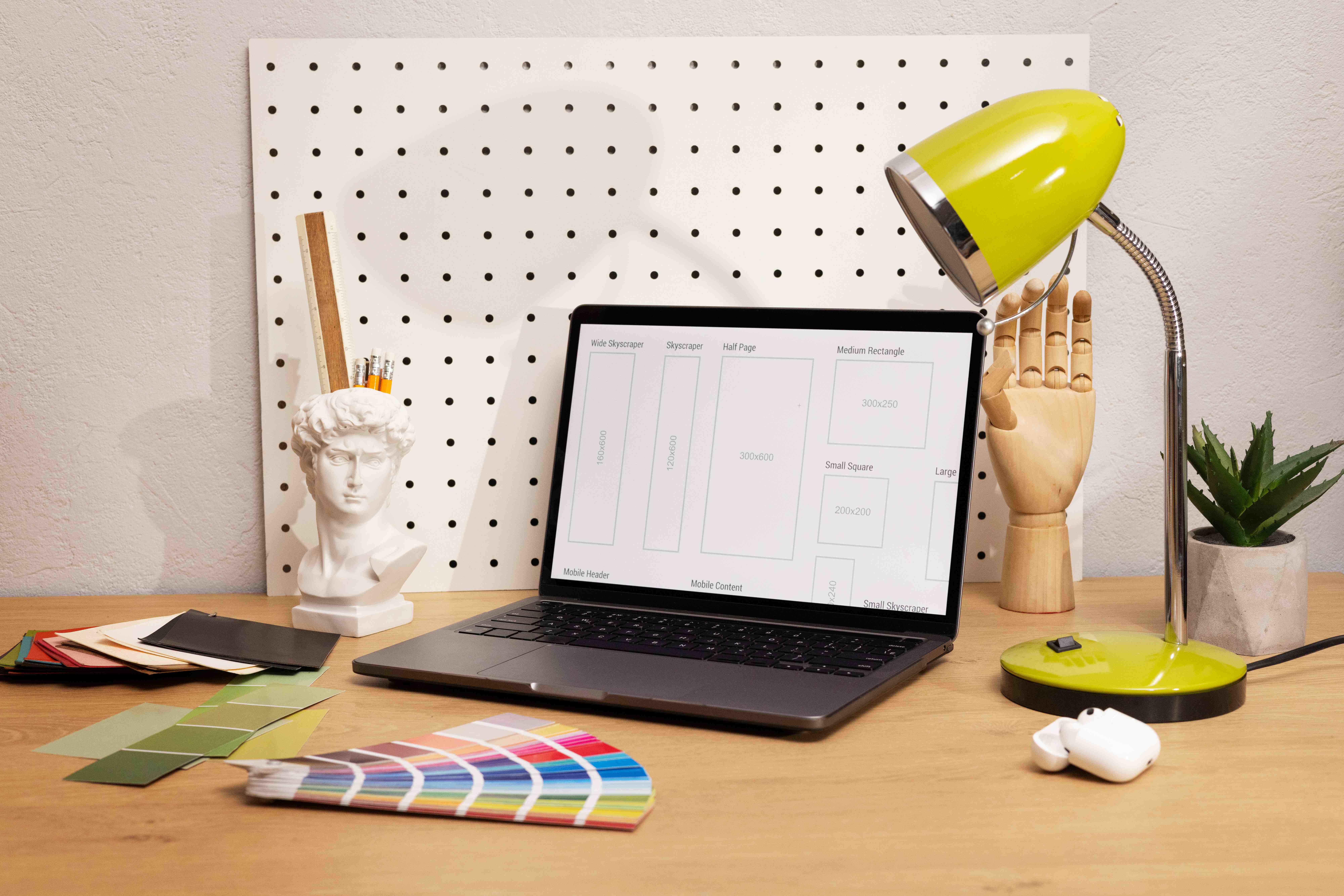
10. Use High-Quality, Relevant Images
Images play a key role in any blog layout. A well-placed image can break up text, make content more engaging, and help illustrate key points.
Best practices for blog images include:
- Choosing high-quality, relevant visuals over generic stock photos.
- Using custom images or branded graphics for a more professional look.
- Ensuring images are optimized for fast loading to improve site speed.
Other Best Practices to Enhance Your Blog Layout
- Scannable Design: Use short paragraphs, headers, bullet points, and images to improve readability.
- Brand Consistency: Keep your blog layout aligned with your brand’s identity for a cohesive experience.
- Vertical Alignment: Ensure text, images, and other elements are properly aligned to maintain a clean look.
- Search Functionality: Adding a search bar improves accessibility and helps users find content faster.
- Author Highlighting: Featuring author names and bios builds trust and allows users to explore more content from specific writers.
Conclusion: Elevate Your Blog Layout for 2025
A well-structured blog layout is crucial for enhancing user experience, improving SEO, and keeping readers engaged. By implementing these blog layout best practices, you can create a visually appealing, easy-to-navigate blog that attracts more visitors and keeps them coming back for more.
Ready to upgrade your blog layout for better engagement and success in 2025? Start making these changes today and watch your blog thrive!
Contact CrazyVendor today to see how we can help you automate operations and grow your business effortlessly.
You can also follow us on social media for more eCommerce insights and updates!
Last News